Problem Title
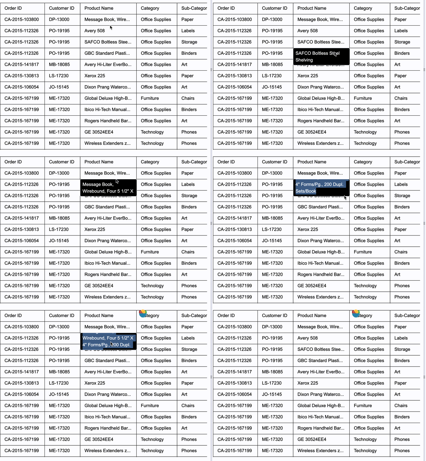
Does the tooltip of the VTable component support selecting text and having a scrolling effect for overflowing content?
Problem Description
I utilized the tooltip feature of the VTable component, which means when the cell content is too long, a tooltip will appear when the mouse hovers over the cell.
However, I found that the content of this tooltip cannot be selected because when the mouse leaves the cell and tries to move to the tooltip, the tooltip disappears and it is impossible to move the mouse over it. Also, when the content is too long, the tooltip will be stretched very large, resulting in an ugly effect. I hope that when the content is very long, I can scroll through it. Can VTable achieve the effect I need?
Solution
VTable provides a configuration solution to this problem. First, normally, as soon as the mouse leaves the cell with the overflowing text, the tooltip disappears immediately, making it impossible to move the mouse to the tooltip. Therefore, a new configuration called overflowTextTooltipDisappearDelay is added to the tooltip configuration to delay the disappearance of the tooltip. After configuring this, the mouse has enough time to move to the tooltip, thus solving the need to select and copy text. (The usage of tooltips for Icons is similar!)
  /** tooltip相关配置 */
  tooltip?: {
    /** html目前实现较完整 先默认html渲染方式 */
    renderMode?: 'html'; // 目前暂不支持canvas方案
    /**  Whether to show the thumbnail tooltip. Instead of the original hover:isShowTooltip configuration, it is temporarily necessary to set the renderMode configuration to html in order to display it. canvas has not been developed yet.*/
    isShowOverflowTextTooltip?: boolean;
*** /** Abbreviation text prompt box delayed disappearance time **/***
**    overflowTextTooltipDisappearDelay?: number;**
    /** 是否将 tooltip 框限制在画布区域内,默认开启。针对renderMode:"html"有效 */
    confine?: boolean;
  };</br>
To limit the size of a tooltip pop-up box, you can configure it in the style of the tooltip. The specific style definition is as follows:
/**
 * Bubble box, button explanation information
 */
export type TooltipStyle = {
  fontFamily?: string;
  fontSize?: number;
  color?: string;
  padding?: number[];
  bgColor?: string;
**  maxWidth?: number;**
**  maxHeight?: number;**
};</br>
Configure it by putting it in the theme.
const option={
   tooltip: {
      renderMode: 'html',
      isShowOverflowTextTooltip: true,
      overflowTextTooltipDisappearDelay: 1000
    },
    theme:{
        tooltipStyle:{
            **maxWidth:200,**
            **maxHeight:100**
        }
    }
}</br>
Code Examples
You can paste it into the official editor for testing:
https://visactor.io/vtable/demo/component/tooltip
let tableInstance;
fetch('https://lf9-dp-fe-cms-tos.byteorg.com/obj/bit-cloud/VTable/North_American_Superstore_data.json')
  .then(res => res.json())
  .then(data => {
    const columns = [
      {
        field: 'Order ID',
        title: 'Order ID',
        width: 'auto'
      },
      {
        field: 'Customer ID',
        title: 'Customer ID',
        width: 'auto'
      },
      {
        field: 'Product Name',
        title: 'Product Name',
        width: '200'
      },
      {
        field: 'Category',
        title: 'Category',
        width: 'auto'
      },
      {
        field: 'Sub-Category',
        title: 'Sub-Category',
        width: 'auto'
      },
      {
        field: 'Region',
        title: 'Region',
        width: 'auto'
      },
      {
        field: 'City',
        title: 'City',
        width: 'auto'
      },
      {
        field: 'Order Date',
        title: 'Order Date',
        width: 'auto'
      },
      {
        field: 'Quantity',
        title: 'Quantity',
        width: 'auto'
      },
      {
        field: 'Sales',
        title: 'Sales',
        width: 'auto'
      },
      {
        field: 'Profit',
        title: 'Profit',
        width: 'auto'
      }
    ];

    const option = {
      records: data,
      columns,
      widthMode: 'standard',
      tooltip: {
        renderMode: 'html',
        isShowOverflowTextTooltip: true,
        overflowTextTooltipDisappearDelay: 1000
      },
      theme:{
          tooltipStyle:{
              maxWidth:200,
              maxHeight:60
          }
      }
    };
    tableInstance = new VTable.ListTable(document.getElementById(CONTAINER_ID), option);
    window['tableInstance'] = tableInstance;

  });</br>
Result Presentation

Related Documentation
Related API: https://www.visactor.io/vtable/api/Methods#showTooltip
Tutorial: https://www.visactor.io/vtable/guide/components/tooltip
github:https://github.com/VisActor/VTable
