overall composition
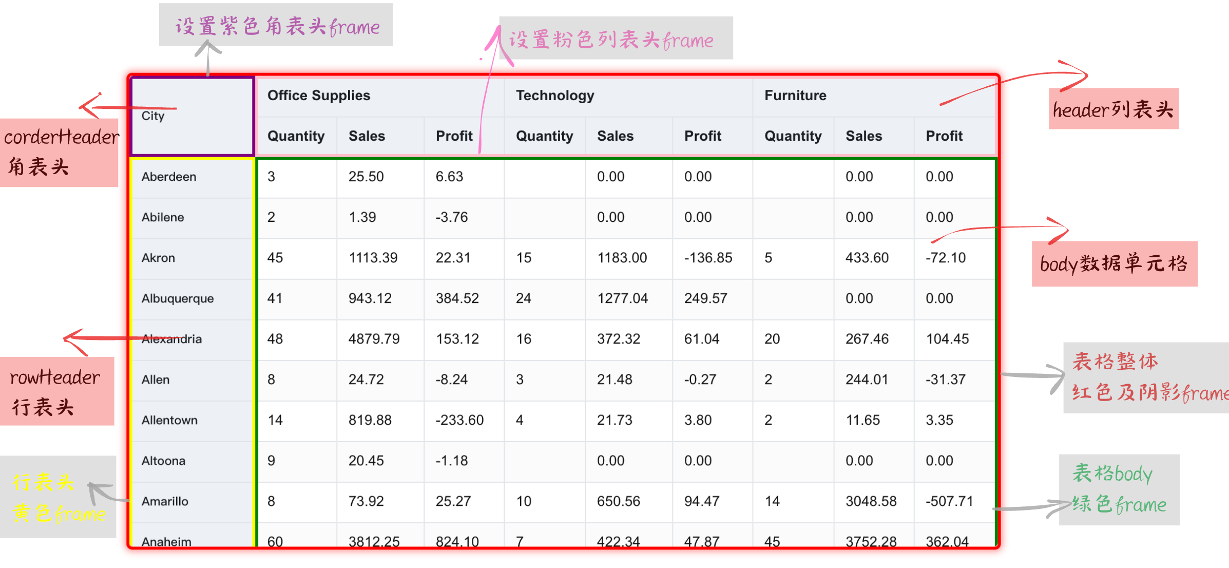
The table consists of five parts, namely row header, list header, corner header, body data cell, and frame, as shown in the following figure:

header
The header is an important part of the table, which is divided into: row header, list header and corner header according to different positions.
- The row header is displayed on the left side of the table, mainly showing the description of the row Dimension information
- The list header is located at the top of the table and mainly displays the description of the column Dimension information
- The corner head is located in the upper left corner of the table and generally describes the Dimension name of the row or column
If it is a pivot table row header display content is determined by the rowTree Dimension tree, and the list header is determined by the columnTree Dimension tree. The structure of a row Dimension tree is defined as follows:
rowTree: [
  {
    dimensionKey:Category',
    value: '办公用品',
    children: [
      {
        dimensionKey: 'Sub Category',
        value: 'Binders',
      }
    ]
  }
]
If it is a basic table, the content of the header is determined by the title configured in columns. As for whether it is displayed in the row header or the list header position, you need to see whether transpose is set to transpose. The following simple configuration:
 columns: [
   {
        "field": "Category",
        "title": "Category",
         "headerStyle": {
          color: 'red',
        },
    },
    {
        "field": "Sub Category",
        "title": "Sub-Category",
    }
]
Corner can be configured in the pivot table to set the display content and style of the corner head, etc. The configuration is as follows:
corner: {
   titleOnDimension: 'row', //角头标题显示内容依据为行维度名称
   headerStyle://设置角表头单元格样式
   {
      textAlign: 'center', // 文本居中显示
      bgColor: '#f5f5f5', // 背景颜色
      borderColor: '#ccc' // 边框颜色
    }
}
Body cell
The body data cell is the most important part of the table to display data, showing the detailed data in the table. We can change the display content, style, arrangement and column width of these data cells through some configuration items to meet various needs.
The settings of the pivot table are mainly concentrated on the indicators configuration item. The data format in the form of a data bar is configured as follows, and the corresponding style of the data bar is configured in style:
indicators: [
      {
        indicatorKey: 'sales',
        title: '销售额',
        cellType: 'progressbar',
        format(value) {
          return `${value}%`;
        },
        style: {
          barHeight: '100%',
          barBgColor: data => {
            return `rgb(${100 + 100 * (1 - (data.percentile ?? 0))},${100 + 100 * (1 - (data.percentile ?? 0))},${
              255 * (1 - (data.percentile ?? 0))
            })`;
          },
          barColor: 'transparent'
        },
      },
    ...
]
The body configuration of the basic table is mainly reflected in the field, cellType and style in the columns configuration item:
columns:[
    {
        "field": "230517143221027",
        "title": "Order ID",
        "cellType": "link",
        "style": {
            "color": 'yellow',
        }
    },
    {
        "field": "230517143221030",
        "title": "Customer ID",
        "cellType": "image",
    },
]
Table border
We can configure the overall border style of the table through the theme.frameStyle option:
theme:{
    frameStyle: {
      borderColor: '#666', // 边框颜色
      borderLineWidth: 2    // 边框宽度
    }
}
The thickness color of the border is configured above, and the outer border also supports shadows. After the configuration is complete, the table will display the corresponding frame style.
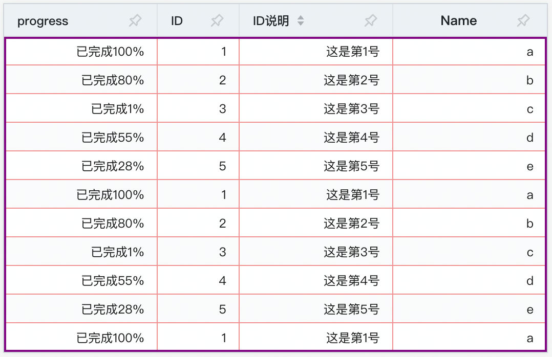
In addition to configuring the outer border of the table, each component of the table can also set a separate border, such asCorner border,List header border,Line header borderandBody borderLet's take configuring the body border as an example:
theme:{
    bodyStyle:{
        frameStyle: {
          borderColor: 'purple', // 边框颜色
          borderLineWidth: 2    // 边框宽度
        }
    }
}
The effect is as follows:

