Theme Theme
In this article, we will learn how to customize and beautify the presentation of data tables with the theme Theme in VTable.
Theme controls the appearance of the table, makes the table more aesthetic, and has some help for data analytics. It should be noted that: Theme theme is to set the style of the table from the whole, and can also be used throughstyleTo style each column separately.
Theme supports setting the static styles of modules such as table header, body and outer border. The settings include: font, font size, color, background color, cell dividing line thickness and color; it also supports dynamic style configuration of each interaction effect module of cells. For example: mouse suspension or style configuration of each cell when selected. For details, please check the configuration items.
Theme style corresponding structure
Refer to the figure below to learn commonly used configuration items

Header Theme
The header is an important part of the table display, and its style directly affects the visual effect of the entire table. The configuration item istheme.headerStyleWe can adjust the background color, border, text style, etc. of the header cells by modifying the configuration items. E.g:
-
Specify the background color of the header cell: you can pass
theme.headerStyle.bgColorTo set the background color of the header cell, support string (directly specify the color value), function (return the color value according to the condition), and CanvasGradient and CanvasPattern objects. -
Define the padding of header cells: you can pass
theme.headerStyle.paddingTo set the margins of header cells, support values (uniformly set the margins in four directions) and arrays (set the margins in the upper, right, lower and left directions respectively). -
Adjust the horizontal alignment of text in header cells: you can pass
theme.headerStyle.textAlignTo set the horizontal alignment of text, supportleft,rightandcenter.
If it is a pivot table, when you need to configure different Themes for different headers, you can passtheme.rowHeaderStyle,theme.cornerHeaderStyleTo configure separately.
Body Theme
Body Theme is mainly responsible for the style configuration of data cells, throughtheme.bodyStyleTo specify.
By modifying the configuration items of the body Theme, you can realize personalized data cell styles. Similar to the header Theme, you can also customize properties such as background color, padding, and text style.
Other Modules Theme Styles
In addition to the table header and body Theme, VTable also provides a series of Theme configuration items for other subdivision modules, such as:
-
Frame Style: Pass
theme.frameStyleTo set the overall border color, width, line style, shadow effect and other properties of the table. -
Column Width Adjustment Style: Pass
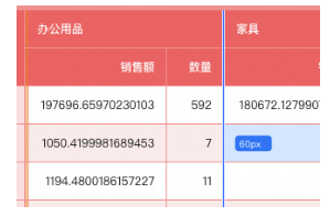
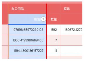
theme.columnResizeTo set the color, width, etc. of the column width drag bar. -
Scroll Bar Style: Pass
theme.scrollStyleTo set the color of the scroll bar track, the color and width of the slider, etc. -
Drag and drop position marker line style: pass
theme.dragHeaderSplitLineTo set the style of the transposition dividing line of the drag and drop table.
By personalizing these modules, richer and more diverse table styles can be achieved.
interactive effect
Set the background effect when the mouse is hovered to a cell by setting the hover background color.

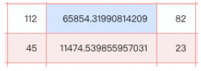
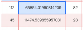
Set the highlighted border and background color when the cell is selected by setting selectionStyle.


Built-in Theme
VTable built-in a set of default Theme /DEFAULT, a set of ARCO style, a set of dark Theme /DARK, a set of distinct Theme /BRIGHT, a set of minimalist Theme /SIMPLIFY
Default Theme Sample Code
The specific configuration content can be viewed at: https://github.com/VisActor/VTable/blob/develop/packages/vtable/src/themes/DEFAULT.ts
// 使用默认主题
option.theme = VTable.themes.DEFAULT;

const tableInstance = new VTable.ListTable(option);
ARCO Theme Sample Code
The specific configuration content can be viewed at: https://github.com/VisActor/VTable/blob/develop/packages/vtable/src/themes/ARCO.ts
// 使用默认主题
option.theme = VTable.themes.ARCO;

const tableInstance = new VTable.ListTable(option);
Dark Theme Sample Code
The specific configuration content can be viewed at: https://github.com/VisActor/VTable/blob/develop/packages/vtable/src/themes/DARK.ts
// 使用默认主题
option.theme = VTable.themes.DARK;

const tableInstance = new VTable.ListTable(option);
Vivid Theme Sample Code
The specific configuration content can be viewed at: https://github.com/VisActor/VTable/blob/develop/packages/vtable/src/themes/BRIGHT.ts
// 使用默认主题
option.theme = VTable.themes.BRIGHT;

const tableInstance = new VTable.ListTable(option);
Minimalist Theme Sample Code
The specific configuration content can be viewed at: https://github.com/VisActor/VTable/blob/develop/packages/vtable/src/themes/SIMPLIFY.ts
// 使用默认主题
option.theme = VTable.themes.SIMPLIFY;

const tableInstance = new VTable.ListTable(option);
Custom Theme
If you can't meet the needs, you can expand it on the basis of a certain Theme, or completely customize it.,
Extend customization
Such as extending for DEFAULT
option.theme = VTable.themes.DEFAULT.extends({ headerStyle:{ color: 'red'}})

const tableInstance = new vTable.ListTable(option);
Full Custom Theme
In short, in VTable, by flexibly using Theme configuration items, we can easily create an exclusive data table style that meets our needs. Please refer to this tutorial to make reasonable configurations based on actual scenarios, and give full play to VTable's powerful Theme customization capabilities.
