
Style Style Introduction
The table style configuration provides flexibility and customization, enabling users to design and beautify the table presentation according to the business data type of each column. If you need to consider the style from the table as a whole, you can use itTheme.
This document describes how to use style and headerStyle to configure table styles to help users better understand and use these features.
A brief introduction
The style refinement configuration of cells in VTable, including cell styles, header cell styles, etc. The configuration of styles is listed as a group of separate configurations (if it is a transposed table, it is used to behave as a group of configuration styles).
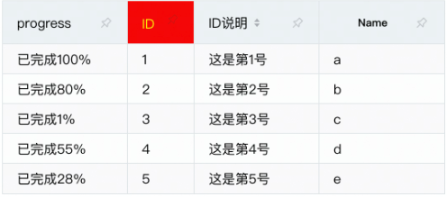
Header cell style configuration
Configure headerStyle in each item of columns. If it is in the pivot table, it corresponds to columns and rows. Example code:
 import * as vTable from '@visactor/vtable';

 const option: vTable.ListTableConstructorOptions = {
 columns: [
  {
    field: 'id',
    title: 'ID',
    headerStyle: {
      bgColor: 'red',
      autoWrapText: true,
      lineHeight: 20,
      lineClamp: 'auto',
      textBaseline: "top",
      color:"yellow"
    },
  }
  ...
];

const tableInstance = new VTable.ListTable(option);
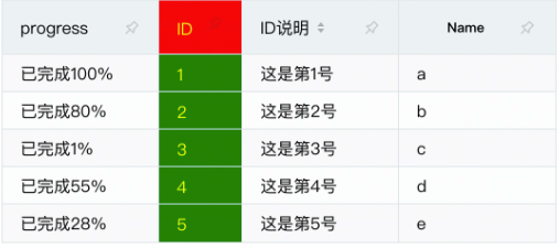
Body cell style configuration
Configure style in each item of columns. If it is in the pivot table, it corresponds to columns and rows. Example code:
 import * as vTable from '@visactor/vtable';

 const option: vTable.ListTableConstructorOptions = {
 columns: [
  {
    field: 'id',
    title: 'ID',
    style: {
      bgColor: 'green',
      autoWrapText: true,
      lineHeight: 20,
      lineClamp: 'auto',
      textBaseline: "top",
      color:"yellow"
    },
  }
  ...
];

const tableInstance = new VTable.ListTable(option);
Style provides a series of cell configurations, briefly described below.
Specific introduction
Cell background color
bgColor: Defines the background color of the cell. Use string or function parameters to set the color.
Text style
textAlign: Defines the horizontal alignment of text in cellstextBaseline: Defines the vertical alignment of text in cellscolor: Defines the text color of the cellfontSize: define cell text sizefontFamily: Defines the text font of the cellfontWeight: Defines the text font weight of the unitfontVariant: Defines the text weight of the cell- 'FontStyle: Defines the text font style of the cell
These settings make it easy to adjust the rendering of text in cells.
border
Contains the following configuration items:
borderColorSet the color of the border for the cellborderLineWidth: cell sets the width of the borderborderLineDash: Set the line dashed style of the border for the cell
Line height, line feed settings
lineHeight: set text height for cell contenttextOverflow: Sets the ellipsed form of the text. This configuration has no effect if autoWrapText sets line wrapping
Underscore, underline settings
underline: set underscores for single cellsunderlineDash: Dashed style of underline.underlineOffset: The distance between underline and text.lineThrough: underline cell text
Link text color
linkColor: Set the text color of the link type.
Mouse hover style
cursor: mouse hover to cell mouse style
Text adsorption effect
textStick: Set whether the text of the cell has an adsorption fruit [Dynamically adjust the position of the cell content when scrolling].Can be set to true to enable, or set to 'horizontal' or 'vertical' to specify in which direction to snap only.
textStickBaseOnAlign: When the cell text has an adsorption effect [the text can dynamically adjust its position when scrolling], the basis for adsorption is the horizontal alignment of the cell. For example, when textStickBaseOnAlign is true and textAlign is 'center', the text will be adsorbed to the horizontal center of the cell; otherwise, it will be adsorbed to the left or right edge of the cell (depending on the scroll position) )
Cell Tag
marked: Set whether the cell has a record style
line wrapping
autoWrapText: Set cell wrapping
Maximum number of rows setting
lineClamp: Set the maximum number of rows of the unit, you can set number or'auto ', set it to'auto', it will be automatically calculated
Cell padding
padding: defines the padding of the cell
The width and height of a cell consists of two parts: padding and content.
Through the above introduction, you have mastered the use of style in VTable, and then you can create a table with a personalized style according to your needs.
Custom style
If you need different styles for different cells, you can use the style function:
style: (args)=>{
  if(args.value>10)
    return {color: 'red'};
  return {color: 'green'};
}
Or set a style in style to a function
style: {
  color(args){
    if(args.value>10)
      return 'red';
    return 'green';
  }
}
Or use style registration to change the style through interface calls. For details, please refer to the tutorial: https://visactor.io/vtable/guide/custom_define/custom_style