
Tooltip Introduction
In table components, a tooltip is a common user interface element used to provide additional information about a specific table cell or data. It appears as a small pop-up window or floating box that displays relevant prompt text when the user hovers over a specific cell or interacts with a specific element.
Tooltip usage scenarios
-
Data interpretation and description: Data in some tables may require additional interpretation or description. Tooltip can be used to display these interpretations to help users understand the meaning, units, calculation methods or other relevant information of the data.
-
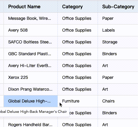
Overflow content: When the text or data in the table exceeds the width of the cell, you can use tooltip to display the full content to prevent truncation or hide important information.
-
Description of Interactive Elements: If the table contains interactive elements (such as links, buttons, or icons), Tooltip can be used to provide functional descriptions or action hints for those elements.
Introduction to configuration items
The configuration items are:
{
  /** 提示弹框的相关配置。消失时机:显示后鼠标移动到指定区域外或者进入新的单元格后自动消失*/
  tooltip: {
    /** 渲染方式:如使用html具有较好灵活性,上层可以覆盖样式;canvas具有较好的跨平台展示稳定性 */
    renderMode: 'html' | 'canvas';
    /** 代替原来hover:isShowTooltip配置 */
    isShowOverflowTextTooltip: boolean;
    /** 弹框是否需要限定在表格区域内 */
    confine: boolean;
  };
}
Tooltip prompt box style settings
The style configuration of tooltip can be set through theme.tooltipStyle. The specific configuration is as follows:
export type TooltipStyle = {
  fontFamily?: string;
  fontSize?: number;
  color?: string;
  padding?: number[];
  bgColor?: string;
  maxWidth?: number;
  maxHeight?: number;
};
Enable overflow content prompt
By default, VTable enables the tooltip of overflow content: isShowOverflowTextTooltip defaults to true. If you need to delay disappearance so that the mouse can move to the tooltip content, you can configure overflowTextTooltipDisappearDelay.
Custom icon hover prompt
For example, the configuration of the table header icon is as follows:
const tableInstance = new VTable.ListTable({
  columns: [
    {
      field: 'orderID',
      title: '订单编号',
      headerIcon: {
        type: 'svg', //指定svg格式图标,其他还支持path,image
        svg: `<svg xmlns="http://www.w3.org/2000/svg" width="12" height="12" viewBox="0 0 12 12" fill="none">
        <path d="M1.29609 1C0.745635 1 0.444871 1.64195 0.797169 2.06491L4.64953 6.68988V9.81861C4.64953 9.89573 4.69727 9.9648 4.76942 9.99205L7.11236 10.877C7.27164 10.9372 7.4419 10.8195 7.4419 10.6492V6.68988L11.2239 2.06012C11.5703 1.63606 11.2685 1 10.721 1H1.29609Z" stroke="#141414" stroke-opacity="0.65" stroke-width="1.18463" stroke-linejoin="round"/>
        </svg>`,
        width: 20,
        height: 20,
        name: 'filter', //定义图标的名称,在内部会作为缓存的key值
        positionType: VTable.TYPES.IconPosition.absoluteRight, // 指定位置,可以在文本的前后,或者在绝对定位在单元格的左侧右侧
        visibleTime: 'mouseenter_cell', // 显示时机, 'always' | 'mouseenter_cell' | 'click_cell'
        hover: {
          // 热区大小
          width: 26,
          height: 26,
          bgColor: 'rgba(22,44,66,0.5)'
        },
        tooltip: {
          style: { arrowMark: false },
          // 气泡框,按钮的的解释信息
          title: '过滤',
          placement: VTable.TYPES.Placement.right,
          disappearDelay: 1000,
        }
      }
    }
  ]
});
The tooltip in headerIcon is the prompt box when the mouse hovers over the icon. At the same time, disappearDelay is configured to delay the disappearance of the pop-up box so that the mouse can move to the tooltip content.
For detailed information about icon configuration, please refer to the tutorial: https://visactor.io/vtable/guide/custom_define/custom_icon.
Display tooltip custom information through the interface
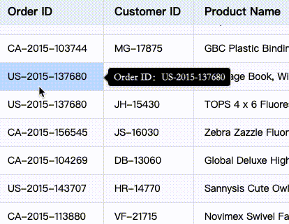
The interface showTooltip can actively display tooltip information, which is used as follows: (listen for cell hover events, call the interface) Reference interface description
  tableInstance.on('mouseenter_cell', (args) => {
        const { col, row, targetIcon } = args;
        if(col===0&&row>=1){
          const rect = tableInstance.getVisibleCellRangeRelativeRect({ col, row });
          tableInstance.showTooltip(col, row, {
            content: 'Order ID:'+tableInstance.getCellValue(col,row),
            referencePosition: { rect, placement: VTable.TYPES.Placement.right }, //TODO
            className: 'defineTooltip',
            style: {
              bgColor: 'black',
              color: 'white',
              font: 'normal bold normal 14px/1 STKaiti',
              arrowMark: true,
            },
            disappearDelay: 100,
          });
        }
    });
Effect:
Icon tooltip configuration
When customizing the icon, you can display the prompt information by configuring the tooltip as follows:
VTable.register.icon('order', {
  ... //其他配置
  tooltip: {
    // 气泡框,按钮的的解释信息
    title:'Order ID is the unique identifier for each order',
    style: {
      fontSize: 14,
      fontFamily: 'Arial',
      padding: [10,10,10,10],
      bgColor: 'black',
      arrowMark: true,
      color: 'white',
      maxHeight: 100,
      maxWidth: 200
    },
    disappearDelay: 1000
  }
})