
Cell Overview
Cell, or cell, is the basic display unit in a table and the smallest visualization unit for data display. In SceneGraph, it exists as an independent rendering unit. In the VTable scene tree module, each Cell displays data, or displays text, links, or interactive elements such as Radio, button, depending on different CellTypes. The existence of cellType describes the display form and interaction logic of the Cell. It is not just a simple way of presenting data, but a flexible data expression strategy. VTable provides users with a multi-dimensional, highly customizable data display solution by defining a rich variety of cell types.
VTable supports seven core cell types: text, link, image, video, progress bar, sparkline, chart; \r
For information on how to configure CellType, you can refer to:
Relevant Source Code Location
- Content under the package/vtable/src/scenegraph/group-creater/cell-type folder: This article includes radio-cell and CheckBox-cell
- package/vtable/src/scenegraph/group-creater/cell-helper.ts: The core file for cell processing in the VTable rendering engine, providing functions for creating cells based on different column types (
createCell), responsible for dynamic cell updates (updateCellandupdateCellContent), etc.- package/vtable/src/scenegraph/group-creater/column-helper.ts: Implements the merging and rendering processing of ComplexColumn based on createCell cell creation;
Detailed Explanation of Special Primitives Rendering
Checkbox
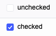
Checkbox type cells are suitable for providing multiple choice options in a table, allowing users to select or deselect one or more items. \r
-
The system first extracts the original values from the data source (supports boolean values, strings, or objects containing
checked/disable/textattributes), synchronizes the checked state through thegetCellValueandstateManager.syncCheckedStatemethods, supporting theindeterminatesemi-selected state. It also merges the checkbox parameters defined in the column (such assize,spaceBetweenTextAndIcon) with the global theme configurationcellTheme, and callsgetHierarchyOffsetto calculate hierarchy indentation, adapting to complex structures like tree headers. \r -
Create a cell container based on the VRender engine and handle the left/right icon layout through
dealWithIconLayout. When instantiating theCheckBoxcomponent, determine the checked state based on the data (prioritizing thecheckedattribute), the disabled state (using thedisableattribute or column configuration function), and custom icons (such as usingcheckIconImageto replace the default check style). Text content is automatically wrapped and line-limited throughautoWrapTextandlineClamp. -
Utilize VRender's boundary calculation capabilities to measure the checkbox icon (default size according to the
size/1.4ratio) and text area. Based on thetextAlignandtextBaselineproperties, implement 9 alignment methods within the embedded area after deductingpaddingandhierarchyOffset. For example, whentextAlign: 'right', the checkbox is right-aligned overall, with the text closely attached to the right side of the icon.
Radio

Radio button type cells are suitable for users to select one among multiple items in the table. \r
When a table needs to render radio cells, it needs to be interpreted from both the data parsing and style combination aspects: \r
-
First, obtain the original values from the data source, style parameters defined in parallel (such as button size, color), and global theme configuration, then determine the horizontal or vertical arrangement direction based on the column setting
radioDirectionInCell, and calculate the level indentation to control the layout display. \r -
Then proceed to the process of rendering the component. The general logic is to first measure the text width of a single option and the icon area based on VRender's boundary calculation capability, then accumulate the spacing according to the arrangement direction (
spaceBetweenRadio), and finally determine the total occupied size of the radio component. \r -
Then, combine the
textAlignandtextBaselineproperties of the cell to align the entire radio group within the embedded area after deducting padding, supporting center, right alignment, and other alignment methods, optimizing the layout selection of the table in the radio element.