It is not only a fully functional graph visualization library, but also an explorer of data relationships.
!!!###!!!title=Detailed Explanation of VTable Perspective Combination Chart——VisActor/VTable Contributing Documents!!!###!!!!!!###!!!description=---title: Detailed Explanation of VTable Perspective Combination Chart
key words: VisActor,VChart,VTable,VStrory,VMind,VGrammar,VRender,Visualization,Chart,Data,Table,Graph,Gis,LLM---
This article will interpret the source code of the VTable perspective, helping developers better understand its internal implementation mechanism.
!!!###!!!
This article will interpret the source code of the VTable perspective, helping developers better understand its internal implementation mechanism.
Definition of Perspective Combination Chart
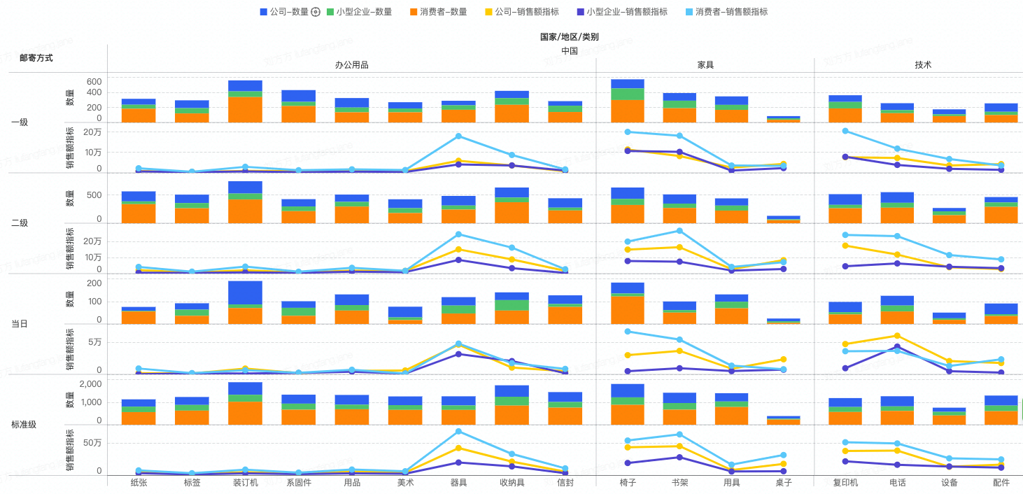
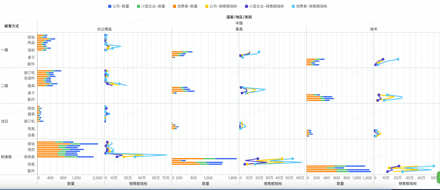
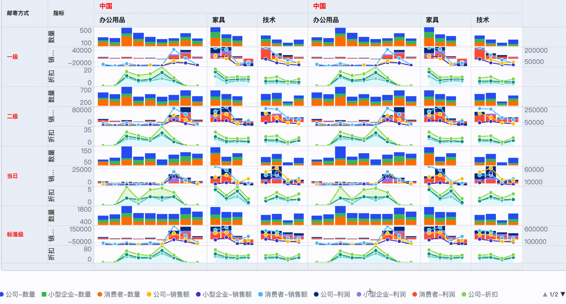
A PivotChart is an advanced table type in VTable that allows users to analyze and visualize data in a multidimensional way. It arranges and combines the same type of charts according to certain rules to form a large chart, with each small chart presenting a portion of the data. This type of chart is usually used to group large amounts of data for better observation and comparison of relationships between different data. \r
Features
Multidimensional Display: The pivot combination chart can simultaneously present multiple data dimensions, allowing users to gain a more comprehensive understanding of the relationships between the data.
Flexible Layout: Different dimensions can be placed in different positions to observe different data results. \r
Data Grouping: It is often used to group data according to certain rules, with each subplot displaying the data of a group, making it easier for users to understand and analyze.
### Application Scenarios
Visualization of Big Data Sets: Pivot combination charts can be used to visualize big data sets by displaying grouped data, helping users better understand the relationships between data. \r
Visualization of Multidimensional Data: It can be used to display multidimensional data by grouping the data according to different attributes and presenting it in the form of charts, allowing users to observe multiple dimensions of data simultaneously. \r
Data Comparison and Analysis: Pivot combination charts can be used to compare and analyze data. By displaying grouped data, users can more easily compare differences and relationships between different data. \r
Data Reporting and Presentation: Using pivot combination charts in data reports can make the reports easier to understand and present.
Comparison Pivot Table
Compared to pivot tables, where each cell displays an aggregated value of a certain metric under a dimension set group, pivot charts present the original data corresponding to this aggregated group in a separate chart. \r
Reuse Pivot Table Logic:
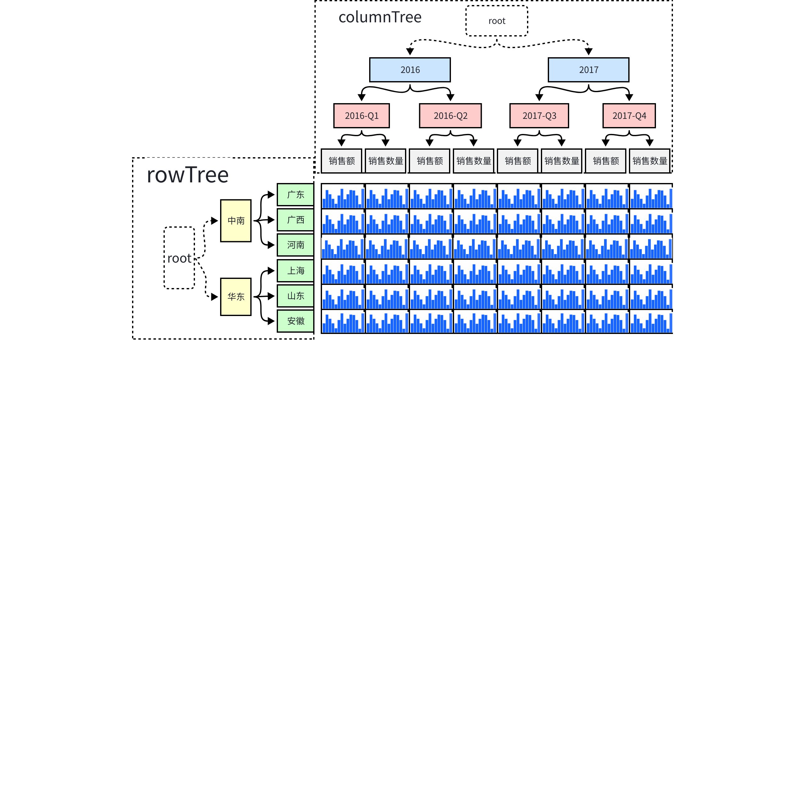
Data Organization: The main logic is consistent with PivotTable, with additional logic for analysis axis range. File path: packages/vtable/src/dataset/dataset.ts; \r
Layout Logic: The dimension values of the table header are mapped to the cell logic, file path: packages/vtable/src/layout/pivot-header-layout.ts; \r
These contents are specifically introduced in the source code interpretation document of the pivot table, and will not be repeated here.
Core Logic
Register chart module
First, register the chart module through VTable.register.chartModule(): \r
VTable.register.chartModule('vchart', VChart);
The module will be stored in the chartTypePlugins object during registration:
export function **chartModule**(*name*: string, *chartModule*?: any): any {
  if (*chartModule* !== null && *chartModule* !== undefined) {
    return register(chartTypePlugins, *name*, *chartModule*);
  }
  return chartTypePlugins[*name*];
}
In the table configuration, reference the registered module through the chartModule attribute:
type and attribute: Indicates the type of element and element configuration, all elements have this attribute; \r
chartInstance: The chart object instantiated using the registered chart module vchart; \r
activeChartInstance: If the cell is activated, an activeChartInstance will be created on the chart element to respond to the interactions of the chart itself; \r
cacheCanvas: Cache the rendered image of the chart for use in the next render to improve rendering performance; \r
Create chart process
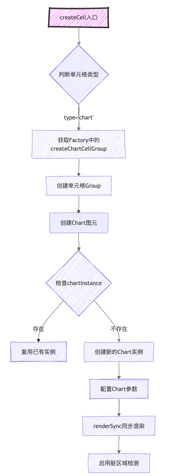
When creating a chart element, the entry point is createCell, where it determines the type of cell to be created. If it is a chart type, it further decides to use the chart element and calls the function **createChartCellGroup**.
One parameter that needs special attention when calling this function is***chartInstance***, because the vtable uses a mechanism where the same chart instance is shared for performance reasons. Therefore, you can obtain the chart instance already created on the metric object based on the cell by calling the interface ***getChartInstance***.***
If an instance has not been created initially, create it in the chart element and later store it in the indicator information through the setChartInstance interface.
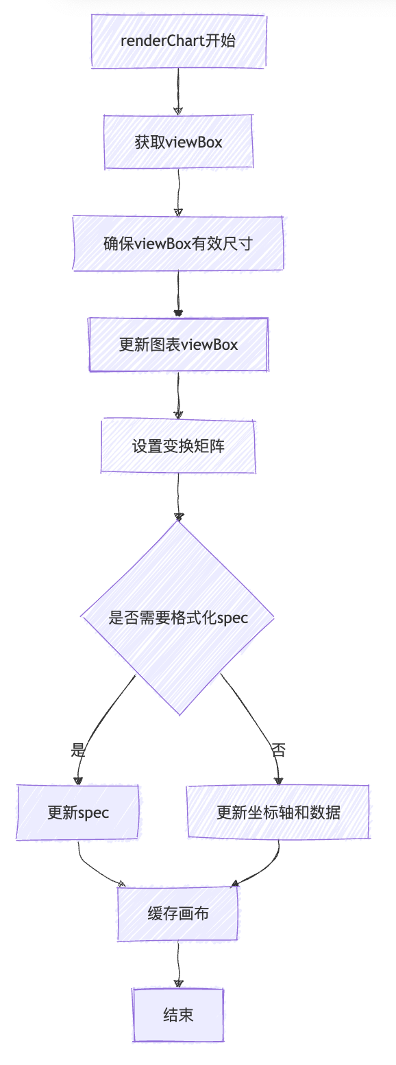
The process of creating a chart mentioned above, when a new chart is created, you can see that apart from configuring the spec, no data is passed. Data is passed during the actual rendering. Specific file path: packages/vtable/src/scenegraph/graphic/contributions/chart-render.ts \r
The core drawing logic is in renderChart, the main logic of renderChart: \r
The cell chart will cache the chart image after the first drawing for subsequent use.
Asynchronous Rendering
In order to further improve the rendering performance of the first screen, there is an asynchronous rendering configuration renderChartAsync. If it is enabled, the chart drawing process of the cells to be rendered will be inserted into the rendering queue. This is particularly suitable for situations where there are a large number of charts displayed on the first screen.
Primitive Chart Activation
As mentioned in the drawing process, the chart drawn in the cell is a cached image, which loses the ability to interact with the chart. To solve this problem, vtable uses the hover state to recreate the chart of the hovered cell and give it interactive capabilities.
The configuration of activeChartInstance does seem a bit more complex compared to the configuration of chartInstance. First, interactive is set to true, and beforeRender and afterRender hook functions are added to control the specific rendering area on the canvas.
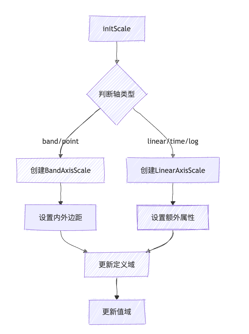
Axis Creation
In a perspective view, besides the chart part in the cell, another important component is the axis. Unlike the axis of a simple single chart that belongs to one chart, the axis in a perspective view is responsible for the axis range capability of the entire row or column of charts. \r
In the logic of creatCell, when there is a configuration related to the perspective chart axis, the Axis component will be created and appended to the cellGroup.
Initialization process: This implementation provides full axis support for charts in the table, which is an important foundational component for chart rendering.
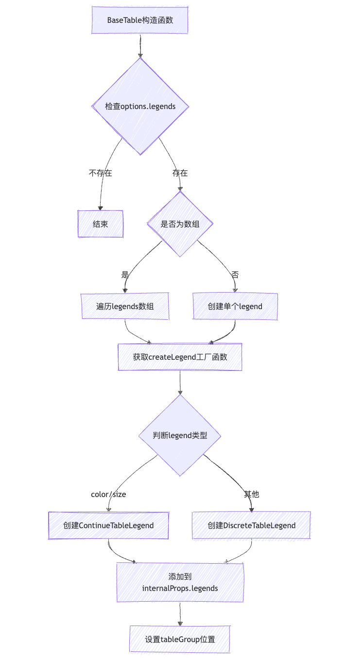
Legend Interaction Linking
VTable also provides a legend component, which can be used to control the display data of the chart by manipulating the legend:
Here is a summary of the creation process. It is important to note that adding a legend will occupy the position of the table, so it is necessary to reset the position of the tableGroup in the scene tree:
Legend click to control the data display logic of the chart:
This logic is not directly integrated into the Vtable code, and users need to call the relevant interfaces themselves, as follows: \r
In addition to updating data through the dataset, all chart caches were cleared and re-rendered. \r
Conclusion:
The VTable pivot table implements rich data analysis functions, providing users with powerful data visualization tools through flexible configuration and efficient data processing mechanisms. Its core lies in the close integration of data processing, layout system, and interactive functions, making complex data analysis simple and intuitive.
This document was revised and organized by the following personnel