It is not only a fully functional graph visualization library, but also an explorer of data relationships.
!!!###!!!title=Axes——VisActor/VChart tutorial documents!!!###!!!!!!###!!!description=The axes in the chart are the basic elements used to represent the relationships between data. They help us better understand the data and guide us in reading and analyzing the chart. This tutorial mainly explains the related concepts and components of the axes. For more detailed configuration and examples of axes, please see the [Configuration Document](../../../option) and [Example](../../../example) pages.!!!###!!!
Axes
The axes in the chart are the basic elements used to represent the relationships between data. They help us better understand the data and guide us in reading and analyzing the chart. This tutorial mainly explains the related concepts and components of the axes. For more detailed configuration and examples of axes, please see the Configuration Document and Example pages.
Components of Axes
According to different coordinate systems (currently, VChart supports Cartesian and polar coordinate systems), we can divide axes into:
X-axis and Y-axis in the Cartesian coordinate system
Radius axis and circular axis in the polar coordinate system
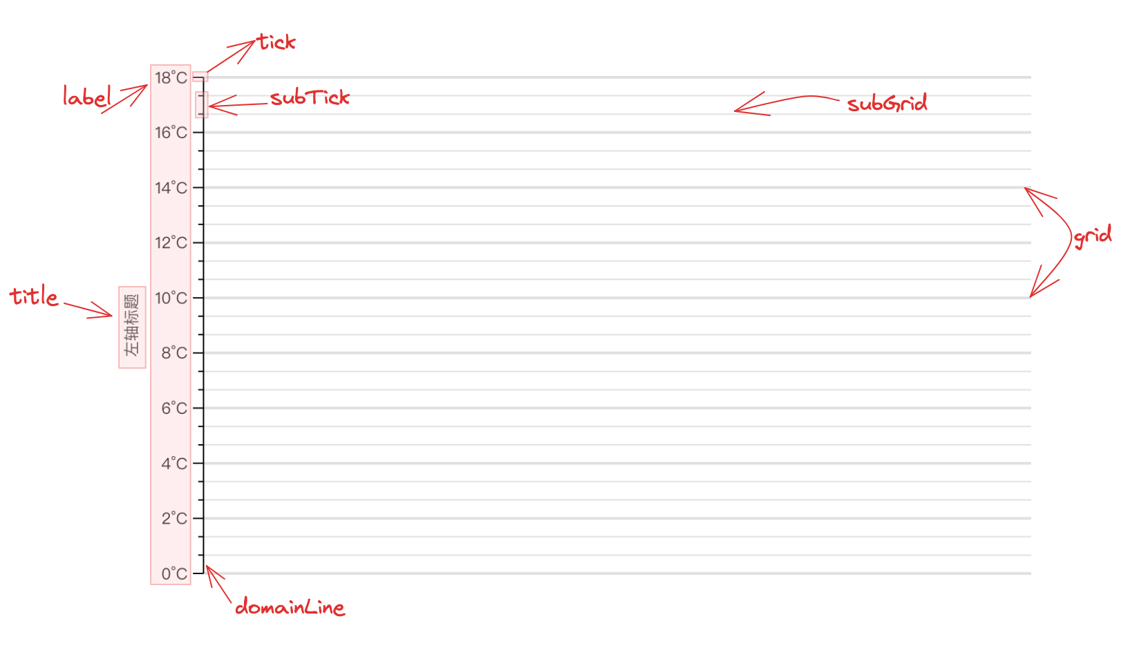
Although the axes have different forms in different coordinate systems, the components of the axes are consistent, consisting of the following parts:
There are currently five types of axes supported in VChart:
Linear axis (type: 'linear'), suitable for numerical data;
Discrete axis (type: 'band'), suitable for discrete data;
Time axis (type: 'time'), suitable for representing time series data, for specific usage please refer to SequenceChart Time Series Chart demo;
It should be noted that histograms do not support discrete axes, as histograms are used to count the frequency distribution of data intervals, and the main axis must be passed in as value intervals, which the discrete axis does not support.
Log axis (type: 'log'), the characteristic of the log axis is that the interval between the scales is calculated according to the logarithmic function (usually base 10). This means that each logarithmic unit (unit of size) of the data has the same physical length, e.g. from 1 to 10, 10 to 100, 100 to 1000, etc. For exponential growth or decline of data, the log axis can better show the relative change of data, the specific use can be viewed log axis demo
Symlog axis (type: 'symlog'), unlike the log axis, symlog can support negative numbers. For specific usage, the specific use can be viewedsymlog axis demo
Cartesian coordinate system axis configuration
In the Cartesian coordinate system, the X-axis defaults to type 'band', while the Y-axis defaults to type 'linear'. When direction is 'horizontal', X defaults to type 'linear', and Y-axis defaults to type 'band'.
For example:
In a normal Cartesian coordinate system, the X-axis is a discrete axis, and the Y-axis is a linear axis:
axes: [
{
type:'band',
orient:'bottom'// Declare the display position },
{
type:'linear',
orient:'left'// Declare the display position }
];
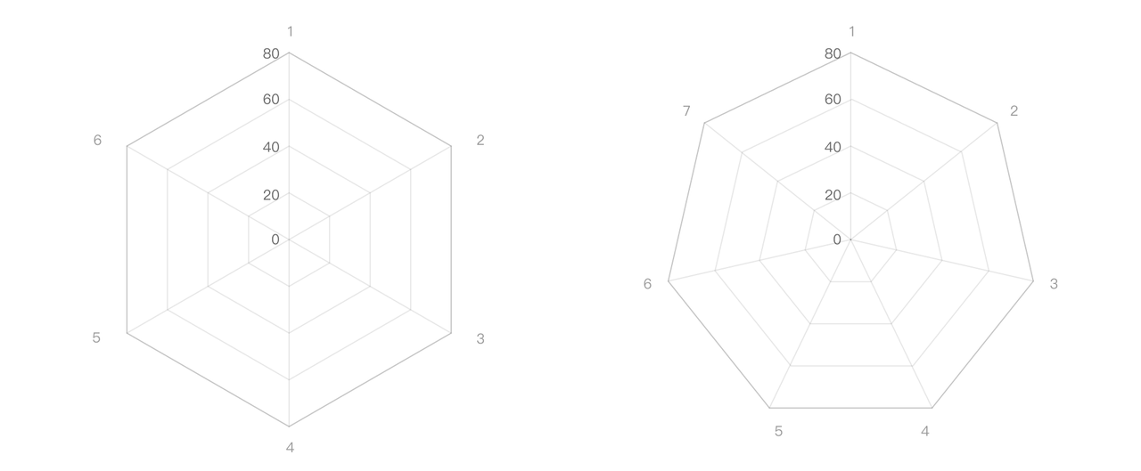
Polar coordinate system axis configuration
In the polar coordinate system, the radius axis defaults to type 'linear', while the angle axis defaults to type 'band'.
axes: [
{
type:'band',
orient:'angle'// Declare as circular axis },
{
type:'linear',
orient:'radius'// Declare as radius axis }
];
Axis range configuration
For linear axes (type: 'linear'/'time'/'log'/'symlog'), we provide the following properties for configuring the data range of the axes:
min: configure the minimum value of the value axis, the priority is higher than zero, nice.
max: Configure the maximum value of the value axis, the priority is higher than zero, nice.
nice: Whether to adjust the axis range to a relatively regular value based on the data. For example, when max = 999 is configured, nice will not optimize the axis range. When min and max are configured, this configuration item becomes invalid. to 1000.
niceType: Configure the type of nice effect, whether accuracy is priority or tickCount is priority (for example, if tickCount is 2, the accuracy of nice will be very low). If not configured, the default is tickCountFirst.
zero: Whether to include 0 values. When min and max are configured, this configuration item becomes invalid.
expand: The axis range is expanded proportionally, such as expand: { min: 0.1, max: 0.1 } When min and max are configured, this configuration item is invalid.
axes: [
  {
    orient: 'left',
    min: 100,
    max: 400
  }
];
For discrete axes (type: 'band'), we provide the following properties to configure the data range of the axis:
domain: Configure the value range of the discrete axes.
The following configuration is provided on the axis tick attribute to control the display spacing, number, etc. of ticks.
tickStep tick step size.
tickCount is the recommended number of ticks and does not guarantee that the result will be the configured value.
forceTickCount forces the number of ticks to be set to ensure that the number of ticks matches the set value, but the tick value may be a decimal due to the data range.
tickMode continuous axis tick generation algorithm, supported since 1.3.0 version, only takes effect when the axis is a linear axis.
noDecimals Whether to avoid decimal ticks, supported since version 1.3.0, only takes effect when the axis is a linear axis.
By default, the axis labels enable the anti-overlapping label sampling capability, which is controlled by the label.sampling attribute of the axis in the corresponding direction on the axes attribute. The following figure shows the default display results when there are too many texts:
We can configure the spacing between labels via label.minGap.
Label layout for the axis component
The axis component itself also provides some layout strategies for axis labels, including:
autoHide automatically hides
autoRotate auto-rotate
autoLimit is automatically omitted
These are all turned off by default. By default, we use the axis sampling layout strategy to prevent overlapping of axis labels, because the axis sampling algorithm performs sampling at the data level, and then draws the coordinate axis components, which has better performance in comparison. So when you need to use the label layout strategy of the axis component, you need to manually enable it.
The following figure shows the effect of configuring autoHide and autoRotate on the x-axis label after turning off the axis sampling:
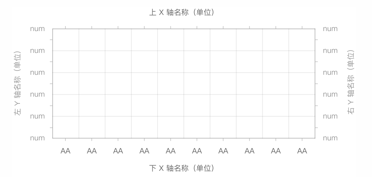
In some cases, multiple axes may need to be drawn in the chart. We only need to add the axis configuration to the axes property as needed.
For example, in the following case, in the Cartesian coordinate system, we draw a double Y-axis, and we only need to make the following declarations:
axes: [
{
type:'linear', // Declare the axis type orient:'left'// Declare the axis display position },
{
type:'linear', // Declare the axis type orient:'right'// Declare the axis display position }
];
Axis and series binding
In multi-series scenarios, we often expect to bind axes to different series. For example, in a dual-axis chart, we expect the left and right axes to correspond to different series.
In VChart, you can configure the axis with the ID of the chart series or the serial number of the series for binding.
{
  series: [
    {
      type: 'bar',
      id: 'bar0',
    },{
      type: 'line',
      id: 'line0',
    },
  ],
  axes: [
    {
      type: 'linear', // Declare the axis type
      orient: 'left', // Declare the axis display position
      seriesId: ['bar0'] // Declare axis bound series
    },
    {
      type: 'linear', // Declare the axis type
      orient: 'right', // Declare the axis display position
      seriesIndex: [1, 2] // Declare axis bound series
    }
  ]
}
Multi-axis synchronization
We provide sync configuration for multiple axes, which can be used to configure 0 value alignment or tick proportional alignment of multiple axes.
In the Cartesian coordinate system, when the numerical axis has positive and negative values, the X-axis line can be displayed on the Y-axis 0 tick by configuring domainLine.onZero.
Zebra line configuration
We can achieve the common zebra line effect by setting grid.alternateColor.
Axis interaction
In the Cartesian coordinate system, the axes support interaction via the select and hover properties. It displays the response at different interaction states through the style changes of the coordinate axis background area semantic label.