The Range Area Chart (Range Area Chart) is a visual encoding graphic used to display the differences between different datasets. In the range area chart, you can clearly see the changes in the minimum value field and maximum value field between each dataset, as well as the gap between them. This type of chart is often used to display the fluctuation range, uncertainty, and trends of data. In VChart, you can easily configure and generate such charts.
Composition of the Chart
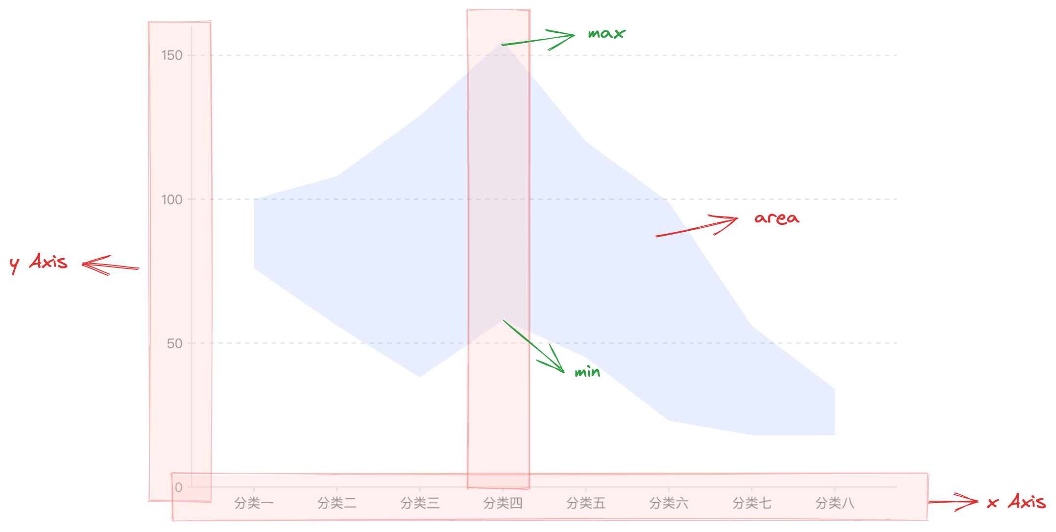
Similar to the area chart, the range area chart is composed of area chart elements, coordinate axes, and other components.
The rectangular chart element is the basic element of the range area chart, and related drawing configurations are essential:
rangeAreaChart.type: Chart type, the type of bar / bar chart is 'rangeArea'
rangeAreaChart.data: Data source for chart drawing
rangeAreaChart.xField: Category field, mapping the x-coordinate of the chart element
rangeAreaChart.yField: Value field array, mapping the lower and upper boundaries of the chart element, i.e., representing the minimum and maximum values of the data
Coordinate axes, tooltips, and other components serve as auxiliary chart display components and are optional configurations with default effects and functions:
rangeAreaChart.axes: Coordinate axis component, displayed by default and automatically infers the coordinate system and data mapping logic based on the chart type, detailed configuration see VChart Coordinate Axis Component Configuration
Since the range area chart can only display the maximum and minimum values of each dimension, in order to display the overall trend of the data, the range area chart is usually combined with the line chart.