Radar Chart is a type of chart used to display multidimensional data. By mapping the values of each dimension to the corresponding angular axis, the distribution of data points in each dimension can be visualized as a closed shape, resembling a "radar".
Chart Composition
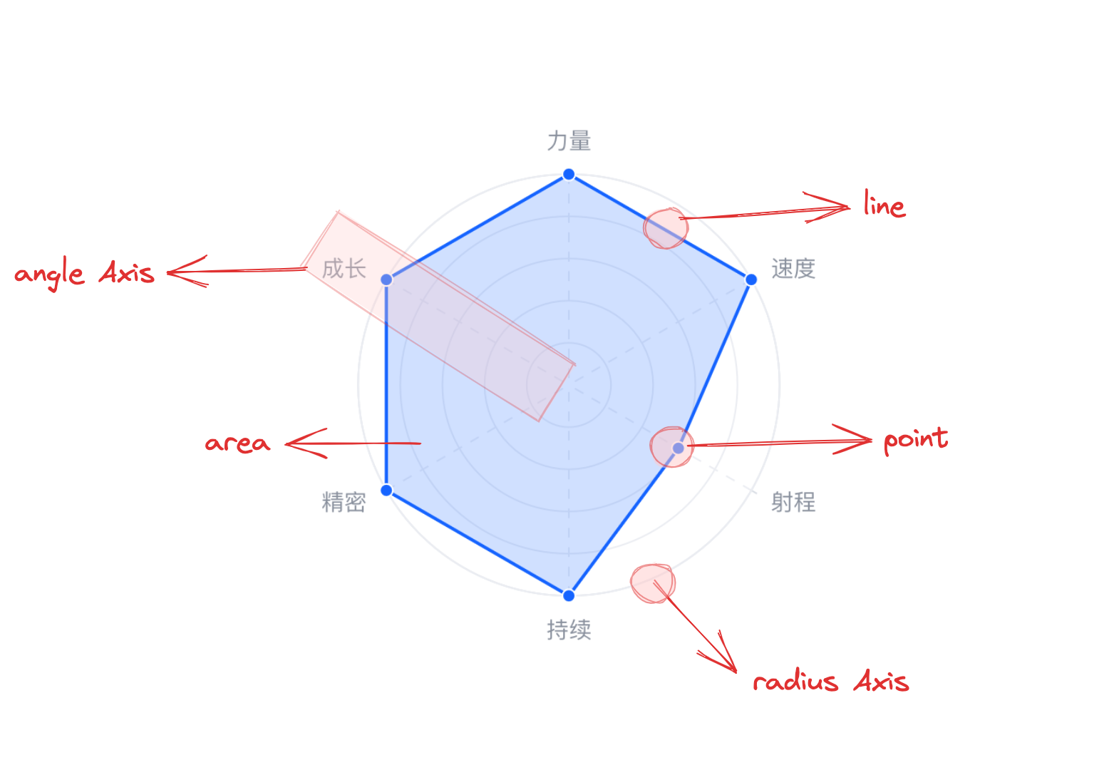
A radar chart consists of closed area chart elements, point chart elements, polar coordinate axes, and other components, all in polar coordinates.
Area chart elements and point chart elements are the basic components of a radar chart, and related drawing configurations are essential:
radarChart.type: Chart type, the type of radar chart is 'radar'
radarChart.data: Data source for chart drawing
radarChart.categoryField: Category field, mapping the vertices of area chart elements or the angles where point chart elements are located
radarChart.valueField: Value field, mapping the vertices of area chart elements or the radii where point chart elements are located
Coordinate axes, tooltips, and other components are optional for auxiliary chart display, with default effects and features:
radarChart.axes: Axis component, displayed by default and automatically inferred based on chart type coordinate system and data mapping logic, detailed configuration see VChart Axis Component Configuration
Grouped radar chart can display multiple radar series at the same time, making it easy to compare different data in the same dimension.
Since the drawing of a radar chart is essentially determined by connected point chart elements, it does not need to be spaced apart like grouped bar charts, grouped rose charts, and other charts, but simply overlaps or intersects. Reflected in the configuration is: Grouped radar chart does not require additional declaration, as long as the number of categories in radarChart.categoryField data is greater than 1, the grouped effect can be displayed automatically. To differentiate different radar chart elements, you need to specify the radarChart.seriesField field, which by default maps the element color.
Stacked Radar Chart
By configuring the grouping field in radarChart.seriesField and enabling the radarChart.stack attribute, you can stack the data of the radar chart.
Percentage Stacked Radar Chart
Enable radarChart.percent on the basis of stacking to obtain a normalized percentage stacked radar chart.