Custom Themes
In the previous chapters, we introduced the basic configuration of themes and color palettes. This section will describe in detail how to configure and update custom themes.
Configuring Themes
VChart provides two ways to configure chart themes: configuring themes through the chart spec and registering themes through ThemeManager. Next, we will introduce the use of these two methods separately.
Configuring Themes through the spec
When defining the chart, we can directly pass the custom theme object that meets the ITheme type into the chart spec's theme configuration item to apply this custom theme. The following example demonstrates how to set a custom theme for a bar chart:
Register themes through ThemeManager
VChart also provides a theme manager called ThemeManager, which you can use to globally register custom themes. You can also use ThemeManager.setCurrentTheme to apply registered themes by theme name.
Updating Themes
In some application scenarios, we may need to dynamically update the chart theme based on user actions or other states. The following will introduce how to hot-update the theme of individual chart instances and global chart instances:
Updating the Theme of an Individual Instance
VChart instances provide a setCurrentTheme method for this purpose. Users need to register the custom theme in the ThemeManager and update the registered theme by the name.
Updating All Chart Themes through ThemeManager
After registering the theme in ThemeManager, you can use ThemeManager.setCurrentTheme to hot-update the registered theme by theme name. Note: This method will affect all chart instances on the page.
Theme Configuration Practices for Digital screen Scenarios
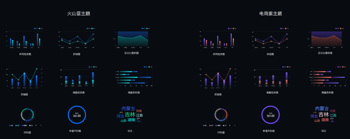
For the big screen, which is heavy on performance and light on analysis, the theme style is especially important. Relying on VChart's theme registration can be configured, the big screen or other similar business scenarios can switch the global style through simple definition and design.

According to the design of the effect, the style of the chart is divided into three modules: "Color Palette", "Meta Style" and "Component Style".
-
The 'color palette' is distilled from business deposits and is open for your reference here: https://github.com/VisActor/VChart/blob/develop/docs/assets/themes/colors.json.
-
"Mark Style" is a gradient effect, which is configured by Mark Gradient Configuration.
-
Component styles are realized through the specific configuration of each component. Eventually, these configurations are written into the theme, and then through the theme registration and switching to achieve different scenarios of the chart style effect.
Of course, VChart also has two sets of built-in themes that users can use without registering. Their specific configurations are as follows:
- dark: https://github.com/VisActor/VChart/blob/develop/docs/assets/themes/dark.json
- light: https://github.com/VisActor/VChart/blob/develop/docs/assets/themes/color.json
The following example demonstrates the above process:
Conclusion
In this chapter, we learned about theme and color palette configuration, how to use custom themes to set personalized styles for charts, and introduced two ways to register custom themes. In addition, we also learned how to dynamically update chart themes as needed. With these skills, you will be better able to use VChart to display beautiful and easy-to-understand data visualization effects. We hope this tutorial helps you get started quickly, making data visualization simpler and more fun!
