Layout Strategies
There are 2 types of built-in layout strategies in VChart, one is based on placeholders, and the other is based on the grid layout. In addition to this, VChart also supports custom layouts. This will introduce the use of built-in layout strategies in detail.
Chart layout elements
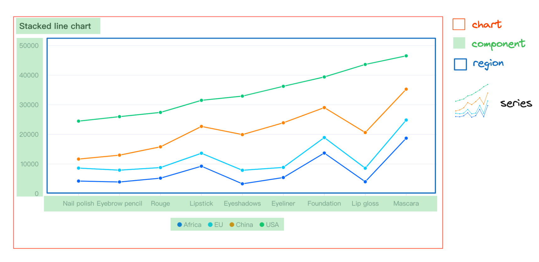
Before introducing the layout strategies, let's first introduce the layout elements of the chart. The layout elements of the chart are the same in different layout strategies. The main layout elements of the chart are:
- Region is also the container of the series, which can be understood as an area of the chart. A chart can have multiple regions, and each region can have one or multiple series.
- Component is the component, and a chart can have multiple components. Such as axis, legend, title, etc.
Since the container region of the series is already involved in the layout, the series itself no longer participates in the layout, and only needs to specify which region the series is in.
As shown below:

Placeholder-based layout
In the placeholder layout, the chart layout elements are divided into several different types
- Normal general layout elements, such as titles and legends, will be placed in the layout at the beginning in sequence.
- Region-relative elements that have a binding relationship with the position of region elements. The size will be calculated once at the beginning of the layout, a location estimation will be performed, and then the layout will be horizontally first and then vertically.
- Region is the series container, and after the layout of region-relative elements is completed, the region elements will be arranged according to the remaining space size.
- Absolute elements, ignoring the location of other elements, taking the origin of the chart canvas as the basis, layout the position according to the layout configuration.
The entire layout process is shown below:

Grid-based layout
In order to meet the layout scenarios of common single column, single row, and similar simple tables, we provide a grid layout. In this layout mode, except for absolute elements, all other elements are treated as basic elements of the layout uniformly, and layout information needs to be specified for these layout modules in the layout configuration.
- modelId is the id of the layout module.
- col indicates the column the element is in. From left to right, starting from 0.
- row indicates the row the element is in. From top to bottom, starting from 0.
- colSpan indicates the number of columns occupied by the current element in the column direction, with a default value of 1.
- rowSpan indicates the number of rows occupied by the current element in the row direction, with a default value of 1.
Note that all layout elements are now treated independently, and the axis and region no longer have a positional relationship. They need to be configured independently.
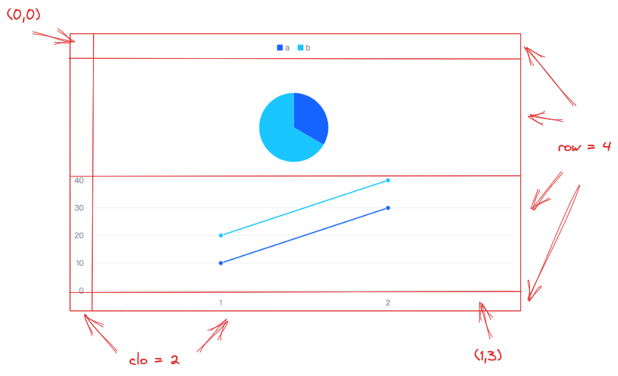
The layout effect is shown in the following figure:

In the above figure, a total of 2 columns and 4 rows. The position information of each element is as follows:
- Legend layout position starts at
(0,0), occupies1row, and2columns. - Pie-region has the layout position starting at
(1,0), occupies1row, and2columns. - Axis-left has the layout position starting at
(2,0), occupies1row, and1column. - Line-region has the layout position starting at
(2,1), occupies1row, and1column. - Axis-bottom has the layout position starting at
(3,1), occupies1row, and1column.
The chart example is as follows:
