A gauge chart is a mimetic chart, just like the speedometer of a car, the scale represents the measurement, and the pointer angle represents the current value.
Chart Composition
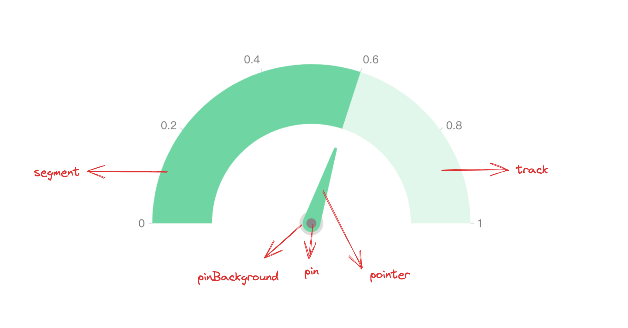
A gauge chart is composed of basic elements such as sector graphics and gauge pointers with progress directionality.
From a data series perspective, the gauge chart is encapsulated by the gauge and gaugePointer series, which draw the gauge dial sector area and pointer. By taking advantage of this feature, you can declare a gauge chart in a Combined Chart way to more flexibly adjust the gauge chart rendering effect.
Sector graphics and gauge pointers are basic elements of gauge charts, and related rendering configurations are essential:
gaugeChart.type: Chart type, the type of gauge chart is 'gauge'
gaugeChart.data: Data source for chart rendering
gaugeChart.categoryField: Classification field, mapping different sectors
Declaring more flexible gauge charts in the form of combined charts
In order to make the gauge chart more mimetic, you can declare the gauge and gaugePointer series in the form of a combined chart and configure animations to dynamically display the progress effect.
The following example cleverly applies the current time as the source data, exquisitely fitting the dynamic dial effect, fully demonstrating the flexibility and practicality of VChart.
Graphics and Styles
Sector Gradient
In VChart, you can use fill.gradient: 'conical' to add a ring gradient effect to the graphics, which will improve the chart's expressiveness. Similarly, the sector graphic for the gauge chart is progress, so just configure gaugeChart.progress.style.fill, for specific configuration, please see VChart Graphics Gradient Detailed Configuration