A bar chart is a statistical chart with a variable based on the length of a rectangle. Bar charts are used to compare two or more values (different times or different conditions), with only one variable, and are often used for smaller data set analysis.
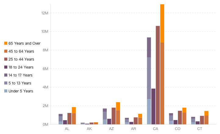
In VChart, you can display data values for multiple groups through the Bar Chart Configuration. As shown in the following figure:
In the example shown above, you need the following key configurations:
Set the mapping field for the x-axis and the grouping field on the xField property.
seriesField property declares the color mapping field.
stack property declares as true to configure stacking, which will be stacked based on the field declared by the seriesField property.
Customize the colors using the color property.
A bar graph is a bar chart with a transpose of the x and y axes. The configuration is basically consistent with the bar chart, except for the need to swap the x and y axis configurations and add the direction property configuration set to 'horizontal'.
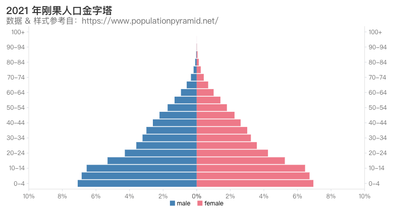
To achieve a Population Pyramid Chart as shown above, you need to use a combination of chart + bar series + layout with the following configurations:
Grid layout, configured through the layout property, used for bar chart layout.
Use the type: common type, i.e., the combination chart.
xAxis and yAxisreverse property, used to achieve bar chart inversion.
Chart Components
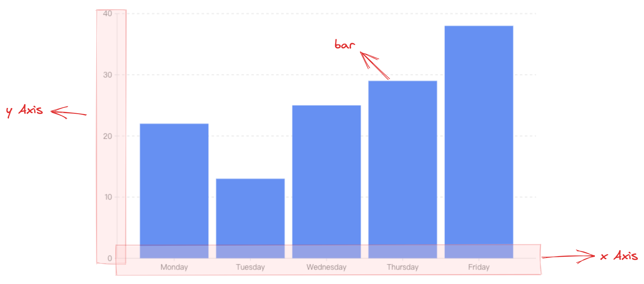
A bar chart consists of rectangular elements, axes, and other components.
Rectangle elements are the basic elements of bar charts/bar graphs, and the corresponding drawing configurations are essential:
barChart.type: chart type, the type of bar chart / bar graph is 'bar'
barChart.data: data source for chart drawing
barChart.xField: categorical field, mapping the x-coordinate/width of the element
barChart.yField: numerical field, mapping the height/y-coordinate of the element
Coordinate axis, prompt information, and other components are optional configurations for assisting in chart presentation and come with default effects and functions:
barChart.axes: coordinate axis component, default displayed, and automatically infer coordinate system and data mapping logic based on chart type, detailed configuration see VChart Coordinate Axis Component Configuration
In real-world scenarios, the data will often contain both positive and negative numbers, such as the difference in sales or revenue from the previous week. In this scenario, we need to distinguish between positive and negative numbers by the coordinate axis zero point. In VChart, you don't need to do any processing for this data scenario. The coordinate axis will adapt to the data range and display it in the best possible way.
Chart Layout
Bar Graph
Setting the direction property to 'horizontal' will create a bar graph.
Grouped Bar Chart
A grouped bar chart can be thought of as a combination of different basic bar series arranged in intervals, with each bar series representing a category. For example, you can break down a group of products into different subcategories such as color, size, style, etc. Each subcategory is represented by a different color so users can more intuitively compare the size and difference of the values.
In VChart, you need to append a field to xField (which will be an array at this point) to distinguish between data categories, i.e., to split the bars of the same dimension into several groups to be displayed in an interval arrangement. To distinguish between the interval-arranged columns within the same dimension, you need to specify the barChart.seriedField field for mapping the column color by default.
Stacked Bar Chart
A stacked bar chart can be thought of as a combination of different basic bar series stacked together with each bar series representing a category. Unlike grouped bar charts, stacked bar charts have the advantage of not only showcasing the data differences of different categories within the same dimension, but also exhibiting the total differences of different categories within the same dimension. The disadvantage is that when there are too many categories and the values are relatively small, it is difficult to discern the height difference of the bars visually.
In VChart, to display a stacked bar chart, you need to configure barChart.stack: true, and to distinguish the stacked bars within the same dimension, you need to specify the barChart.seriedField field, which by default maps the bar color.
Percentage Stacked Bar Chart
In the previous section, we mentioned that the disadvantage of stacked bar charts is that when there are too many categories and the values are relatively small, it is difficult to discern the height differences of bars within the same dimension. For this scenario, we can use percentage stacked bar charts, which can help us obtain the height mapped by the normalized values within the same dimension and help us better identify the differences.
In VChart, to display a stacked bar chart, you need to configure barChart.stack: true and barChart.percent: true, and to distinguish the stacked bars within the same dimension, you need to specify the barChart.seriedField field, which by default maps the bar color.
Chart Elements and Styles
Linear Gradient
By configuring barChart.bar.style.fill: { gradient: 'linear' }, you can achieve a gradient bar effect.