Graphic elements are the basic drawing units in charts, and all the graphics in the charts are composed of graphic elements. Graphic elements can be points, lines, rectangles, circles, sectors, rings, paths, etc. In a chart, the type of graphic elements is usually determined by the series type. The number and style of the graphic elements are determined by the data, such as the points in a line chart, the columns in a column chart, the sectors in a pie chart, etc.
Style Attributes of Graphic Elements
There are usually two types of attributes for graphic elements: common attributes and specific attributes. Common attributes are those shared by all graphic elements, such as position, size, rotation angle, transparency, etc. Specific attributes are usually unique to specific types of graphic elements, for example, the points in a line chart can be configured with shape, and the sectors in a pie chart can be configured with inner radius | outer radius, etc.
The configurable attributes of specific graphic elements can be found in the corresponding chart documentation.
States of Graphic Elements
In VChart, the states of graphic elements are abstracted based on common chart interactions and are divided into the following categories:
default: Default state, the initial state of the graphic element.
hover: Pointer hover state, the state of the graphic element when it is hovered over by the mouse pointer.
hover_reverse: Non-pointer hover state, the state of other graphic elements when a graphic element enters the hover state.
selected: Selected state, the state of the graphic element when it is selected.
selected_reverse: Non-selected state, the state of other graphic elements when a graphic element enters the selected state.
dimension_hover: Dimension hover state, the state when the mouse pointer hovers within a certain x axis area.
dimension_hover_reverse: Non-dimension hover state, the state of other graphic elements when a graphic element enters the dimension_hover state.
In different states, graphic elements can be individually configured with styles. For example, in the hover state, the color of the graphic element can be configured to be red, while in the default state, the color can be configured to be blue. Moreover, multiple states can be active simultaneously. For example, in the hover state, the color of the graphic element can be configured to be red, while in the selected state, the size can be configured. In this case, when the selected element is hovered over, the color is red and the size is 10. See the example below:
Custom States of Graphic Elements
In addition to the built-in interaction states, VChart also supports custom states. The configuration method for custom states is consistent with that for built-in states. However, when configuring, the state name needs to be specified. For example, in the following example, a custom state is configured. When the graphic element enters the custom state, its color is red.
Style Configuration of Graphic Elements
The most common configuration method can be seen in the examples above, where the style values can be directly configured in the corresponding styles. In addition to this method, VChart also supports two other configuration methods.
Scale Configuration
By configuring styles through scale. The advantage of this method is that by configuring the styles of graphic elements through scale, a relationship between the styles of graphic elements and the data can be established. For example, the size of graphic elements can be configured according to the data size, or the color of graphic elements can be configured according to the data color, etc.
For the specific usage of scales, please refer to the documentation scale.
Function Configuration
By configuring styles through functions, the highest level of flexibility can be achieved, and arbitrary customizations can be made to the styles of graphic elements. For example, in the following example, the color of the graphic element is configured through a function. When the y value of the data is greater than or equal to 30, the color of the graphic element is red; otherwise, it is blue.
Gradient configuration
The graphic elements of the chart can be configured with gradient colors, column graph, [line graph](../../../.. /demo/gradient/line), area, [bubble](../../../../demo /gradient/bar) etc. can be used.
The basic concept and configuration interface of gradient color
VChart's gradient color configuration format aligns with CanvasRenderingContext2D's gradient color API. Different gradient types have different gradient effects. Generally speaking, the gradient color capability we provide is based on a specific two-dimensional space rule to fill graphics with continuous colors.
If you want to understand the drawing mechanism of the gradient color, please read the corresponding gradient color document above, which has a detailed description of the effect.
The relationship between the coordinate position of the gradient color and the primitive
Each gradient configuration has multiple position-related properties. Take the most commonly used linear gradient as an example:
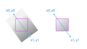
There are 2 sets of coordinates in the configuration: [x0,y0], [x1,y1] represent the start and end points of the linear gradient respectively, and the gradient color will proceed along the route from the start point to the end point. In VChart, the configuration of these two sets of coordinates is also supported, but there are some differences from the native API. In the native API, these two sets of coordinates are pixel positions. In VChart, in order to facilitate user configuration, we provide a proportional configuration based on the element's bounding box.
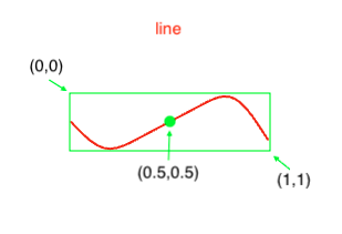
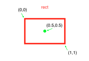
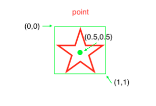
Use several pictures to illustrate the gradient position of different chart elements
Therefore, when configuring x0: 0, y0: 0.5, x1: 1, y1: 0.5 on the gradient color of the line, it means that the direction of the gradient is from left to right.
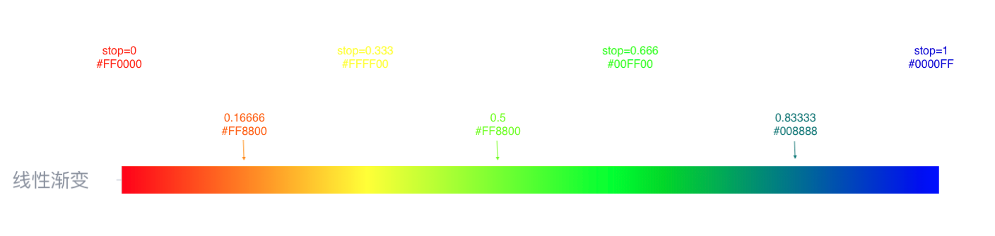
The meaning of gradient color stop
In VChart, the stop in the gradient configuration is no different from the native drawing API above. When stop is the key node of the gradient color, the color will be different according to the gradient type between the key nodes.
We can imagine that the complete gradient is a [0,1] number axis, and stop is the point on this number axis. After we configure a fixed color for the corresponding point, other points on the number axis will be based on the 2 before and after it. A stop for color difference.
In the schematic diagram below, 4 stops are set, and the color of the entire column is filled according to the difference rule:
This particular gradient color chart expects the portion of the line above 60 points to be green and the portion below 60 points to be red. We can find a way to make a specific set of stops to achieve
// We first use scores to divide these stop nodes
0 => 'red'60 => 'red'60 => 'green'100 => 'green'
Yes, you can set two stop nodes at the same numerical position, so that the difference is always red for the position less than 60 minutes, and the difference is always red for the position greater than 60 minutes. It's green.
Now one question is how to calculate the stop of 60 points, its actual scale coordinates in the graph. Here is a calculation method.
ps: It is necessary to obtain the maximum and minimum values in the data in advance
const max; // The maximum value in the data, which can be obtained by traversing the dataconst min; // The minimum value in the data, which can be obtained by traversing the dataconst mid = 60; // the data value you want to use as the dividing pointconst percent = (max - mid) / (max - min);
